
FINCH
UX Designer
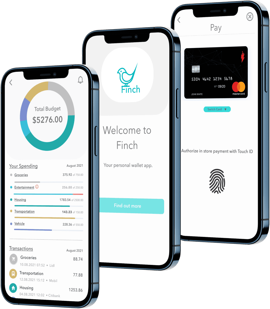
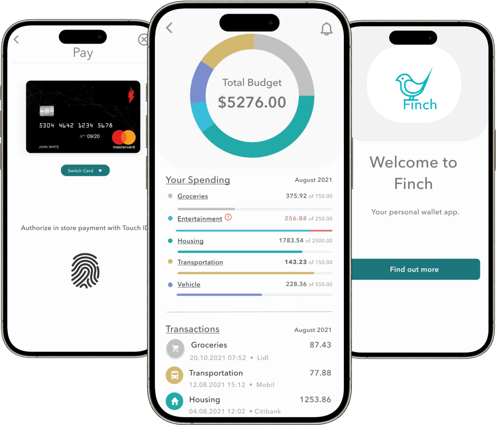
Effortless Finance
Money management with a Streamlined e-Wallet App
- Case study
Overview
Designing a web-based solution to simplify personal finance management with features for budgeting, payments, and transfers.
methodologies
User Interviews
Surveys
Competitive Analysis
User Journey
Card Sorting
Usability Testing
Time to read
3, 7 or 21 Minutes
1/3
The problem
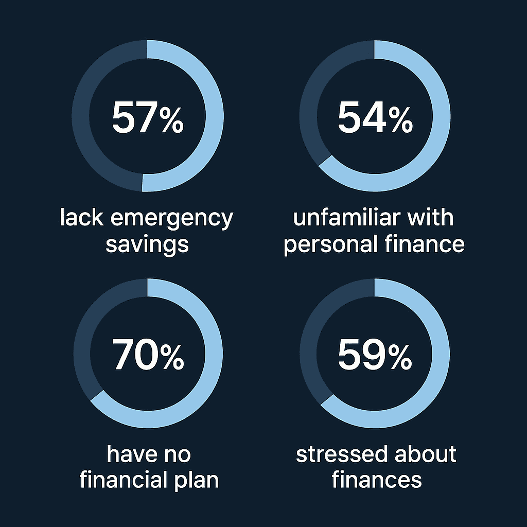
Refining a personal finance web app with features for budgeting, peer-to-peer payments, and transaction tracking.
THE GOAL:
🎯 Goal: Create a seamless, accessible financial tool for users to send money, manage spending, and build better financial habits.
MY ROLE:
🧠 My Role: Led UX design from research through high-fidelity mockups.
KEY OUTCOMES
Designed a mobile-first experience with intuitive navigation and real-time budgeting tools
Delivered clean, accessible UI grounded in usability testing
Identified a market gap for approachable budgeting in finance apps
Improved onboarding completion and task efficiency through targeted iterations
2/3
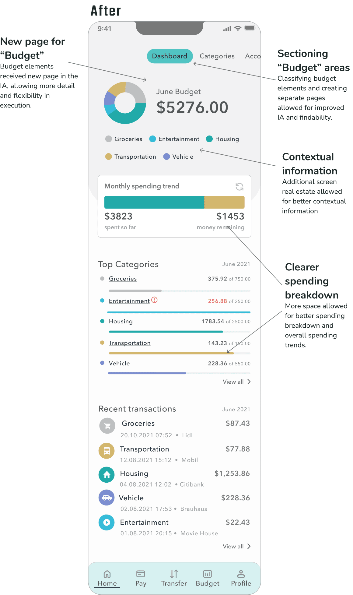
key usability insights
Usability testing surfaced several opportunities to improve clarity, hierarchy, and navigation within the dashboard experience:
🔧 Usability Fix: Problem → Action → Result
🧩 Problem: Core tasks were hard to complete due to poor hierarchy and unclear labels.
⚙ Action: Improved layout, clarified labels, and streamlined navigation.
📈 Result: Users completed tasks faster and navigated with greater confidence.


🔧 Budget Clarity Fix: Problem → Action → Result
🧩 Problem: Users were confused by overlapping balance and budget info.
⚙ Action: Separated budget into its own section with clearer layout and context.
📈 Result: Users understood their spending more easily and navigated with confidence.

3/3
wrap up
Designing for Clarity, Control, and Confidence
THE WHAT:
We turned a confusing finance experience into one that was clear, intuitive, and easy to navigate.
Through research and testing, we:
Pinpointed friction that eroded user confidence
Simplified the dashboard to improve clarity
Reworked navigation and labels for easier discovery
Helped users feel more in control of their money
What began as small tweaks became a major usability win—proof that even minor design choices (like button placement or word choice) can deeply impact trust and comprehension.