
FINCH
UX Designer
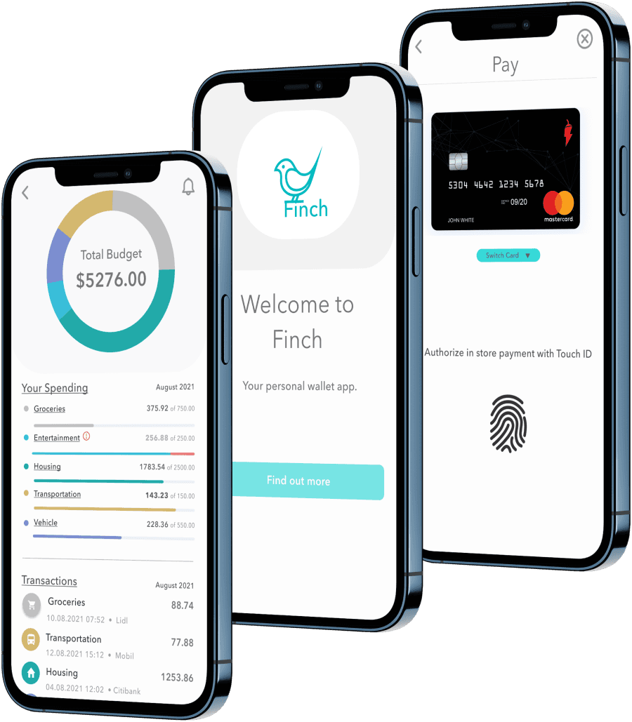
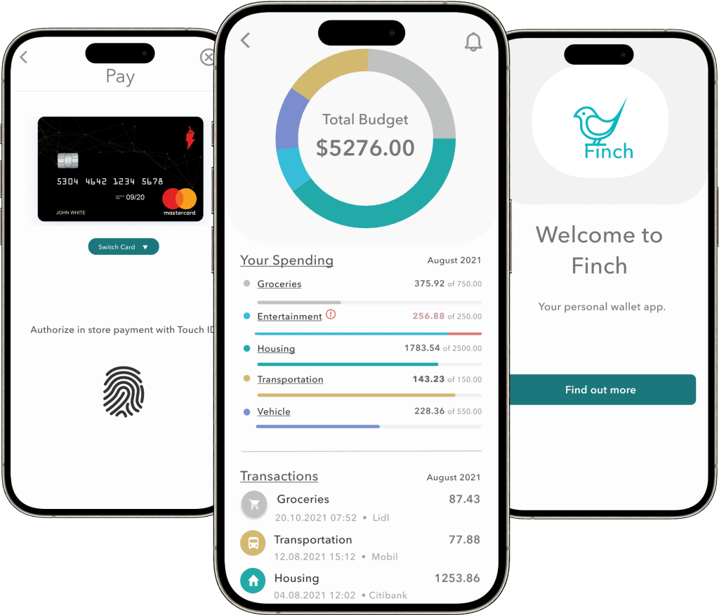
Effortless Finance
Money management with a Streamlined e-Wallet App
- Case study
Overview
Designing a web-based solution to simplify personal finance management with features for budgeting, payments, and transfers.
methodologies
User Interviews
Surveys
Competitive Analysis
User Journey
Card Sorting
Usability Testing
Time to read
3, 7 or 21 Minutes
1/4
The problem
Refining a personal finance web app with features for budgeting, peer-to-peer payments, and transaction tracking.
THE GOAL:
🎯 Goal: Create a seamless, accessible financial tool for users to send money, manage spending, and build better financial habits.
MY ROLE:
🧠 My Role: Led UX design from research through high-fidelity mockups.
KEY OUTCOMES
Designed a mobile-first experience with intuitive navigation and real-time budgeting tools
Delivered clean, accessible UI grounded in usability testing
Identified a market gap for approachable budgeting in finance apps
Improved onboarding completion and task efficiency through targeted iterations
2/4
inspecting the problem space

HMW help people with their personal finances?
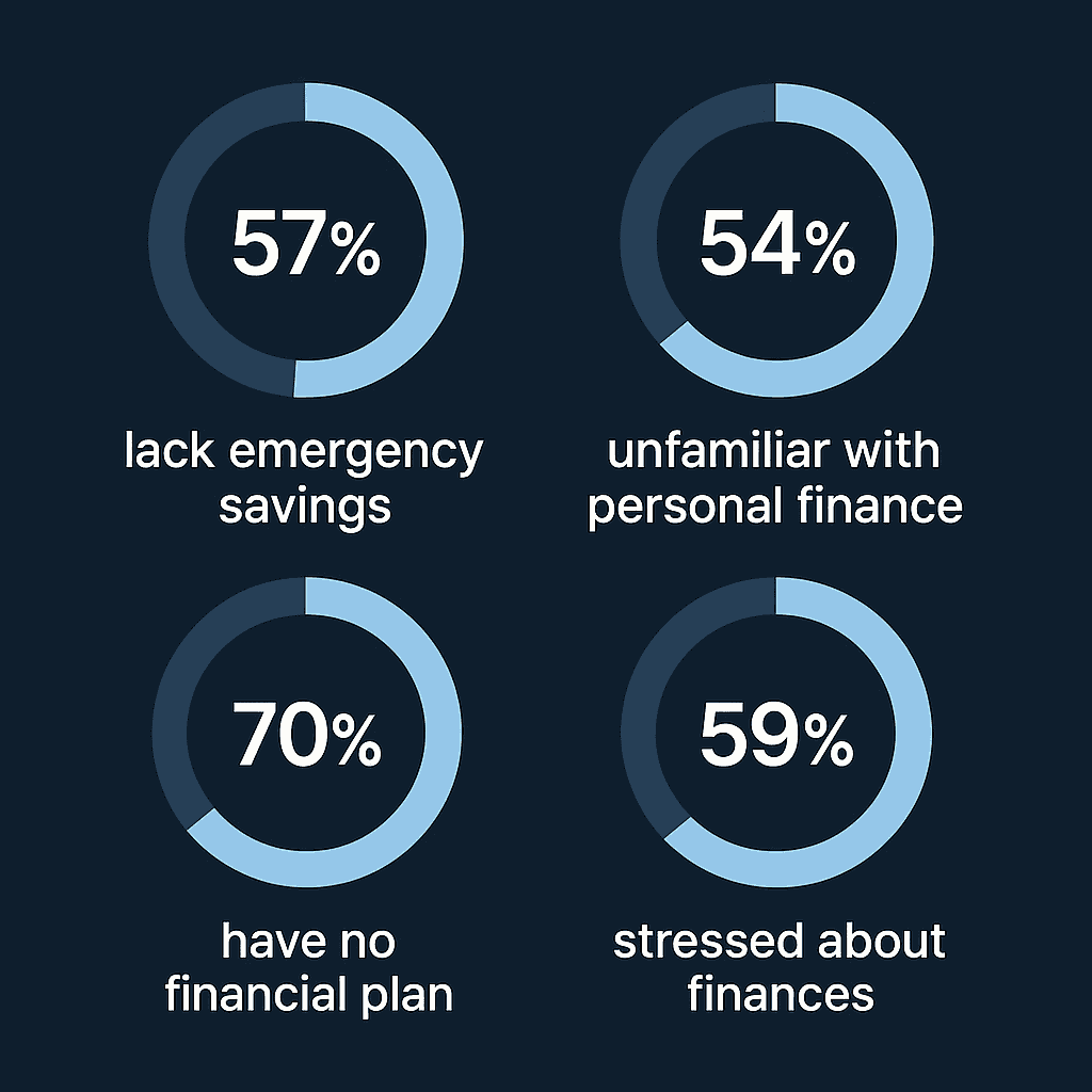
Research shows:
A growing body of research shows that many people struggle with money management. Over half of Americans can’t cover a $1,000 emergency, and most lack a long-term financial plan. These challenges highlight the need for a more approachable tool—one that simplifies personal finance and helps users feel more in control of their money.
Design Approach
🧭 Research
Surveys + interviews revealed demand for budget tools and intuitive navigation
Competitive analysis exposed gaps in transparency and simplicity
IA Card sorts inform structure
3/4
failing towards excellence
Usability testing surfaced several opportunities to improve clarity, hierarchy, and navigation within the dashboard experience:
🔧 Usability Fix: Problem → Action → Result
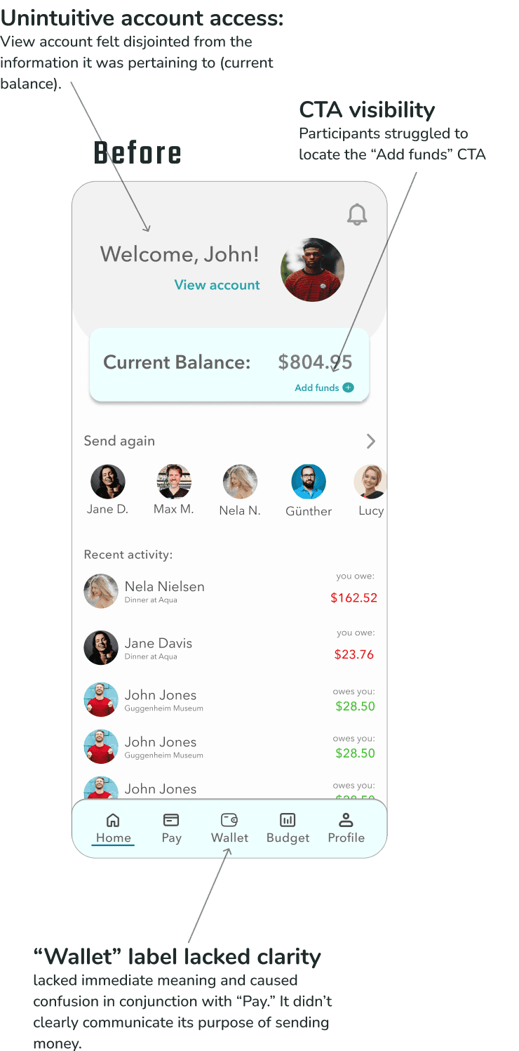
🧩 Problem: Users struggled to complete core tasks—adding funds, accessing account settings, and interpreting balances—due to poor hierarchy, unclear labels, and misplaced CTAs.
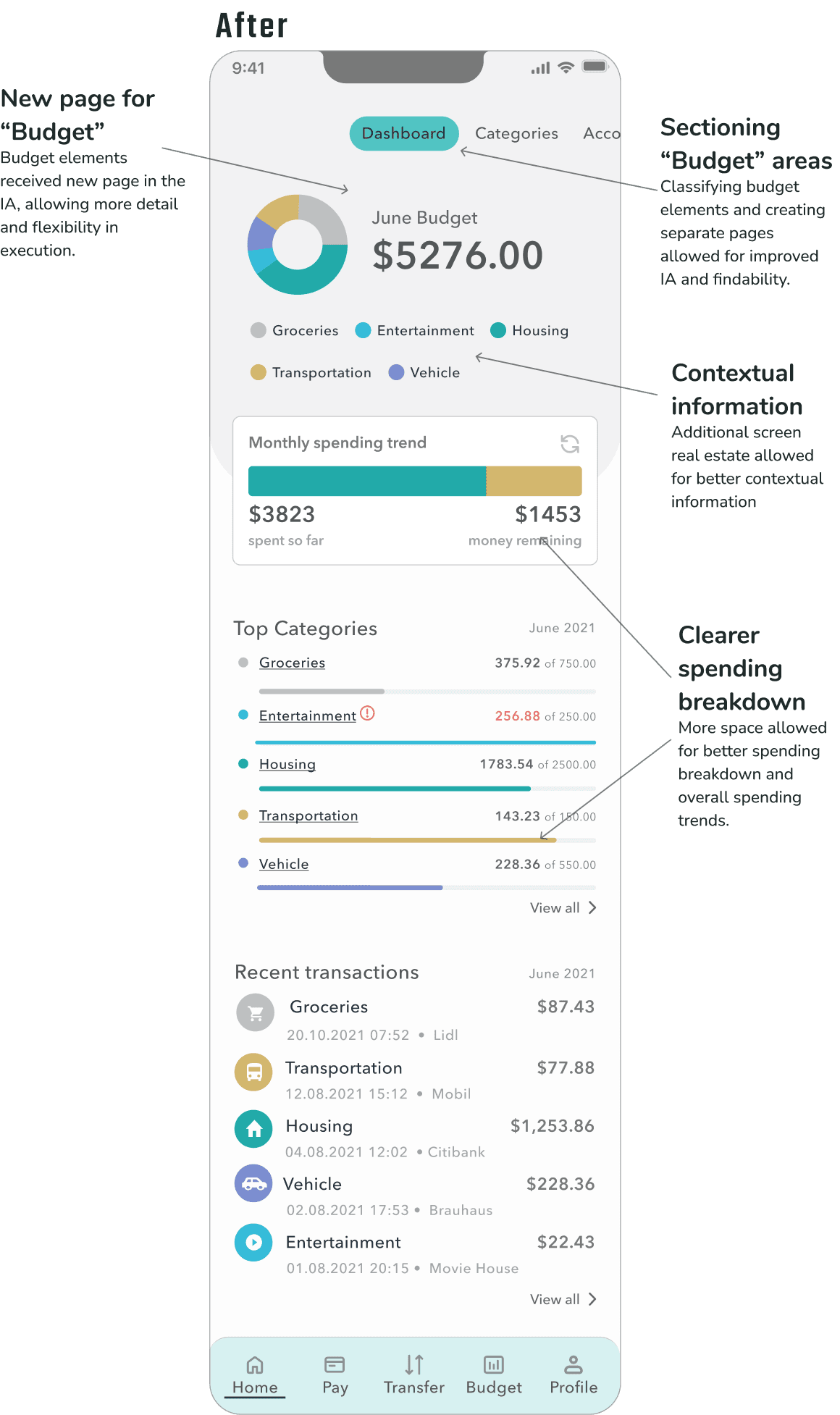
⚙ Action: We clarified the layout by repositioning funding actions near the account balance, reduced visual noise by minimizing the greeting and removing the profile image, and improved navigation by replacing vague labels like “Wallet” with clearer terms like “Transfer.”
📈 Result: Users completed tasks faster, navigated more confidently, and clearly understood their account and budget information—leading to a more intuitive, trustworthy experience overall.

🔧 Budget Clarity Fix: Problem → Action → Result
🧩 Problem: Users were confused by the proximity of account balance and budget totals, and found the budget categories cluttered and hard to interpret—leading to uncertainty about where their money was going.
⚙ Action: We restructured the information architecture by giving budgets their own dedicated section, allowing for clearer layout, improved categorization, and more contextual guidance around spending trends.
📈 Result: Users better understood how their budget related to their available balance and were able to navigate and interpret spending insights with greater ease and confidence.

usability test insights
Funding CTA Lacked Visibility
Participants struggled to locate the call-to-action for adding funds. The button was visually subtle and not positioned where users expected it.Account Access Felt Unintuitive
Users expressed frustration when trying to access their account settings, noting that the greeting and profile picture—currently serving as the entry point—didn’t feel meaningful or clearly interactive.Balance & Budget Placement Caused Confusion
Displaying the account balance and total budget in close proximity created cognitive dissonance. Participants weren’t sure which figure to focus on or how they related to each other.Budget Categories Felt Cluttered
The arrangement of budget categories on the dashboard felt disorganized to users. Several participants described them as “out of place” or “crowding the experience,” making it harder to get an at-a-glance understanding of their finances."Wallet" Label Lacked Clarity
The term “Wallet” in the tab bar wasn’t intuitive to most users. It lacked immediate meaning and didn’t clearly communicate its purpose or contents.
4/4
wrap up
Wrap-Up: Designing for Clarity, Control, and Confidence
THE WHAT:
We turned a confusing finance experience into one that was clear, intuitive, and easy to navigate.
Through research, iterative testing, and close attention to user feedback, we:
Identified key friction points that were undermining confidence.
Restructured the dashboard to improve hierarchy and reduce visual noise.
Reframed navigation and labeling to make core actions more discoverable.
And most importantly, helped users feel more in control of their money.
What started as subtle layout and language tweaks became a major usability win. And it was a reminder that small design decisions—like button placement or terminology—can have an outsized impact on trust and comprehension.