
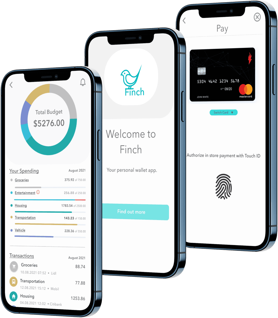
FINCH
UX Designer
Effortless Finance
Money management with a Streamlined e-Wallet App
- Case study
Overview
Designing a web-based solution to simplify personal finance management with features for budgeting, payments, and transfers.
methodologies
User Interviews
Surveys
Competitive Analysis
User Journey
Card Sorting
Usability Testing
Time to read
3, 7 or 21 Minutes
1/8
The problem
Empowering users to better track, send and spend their money.
THE WHAT:
While cash still plays a role in some transactions, the demand for convenient and efficient financial management tools is growing. Existing solutions often lack user-friendly features for easy expense tracking, peer-to-peer money transfers, and seamless purchasing experiences.
THE WHY:
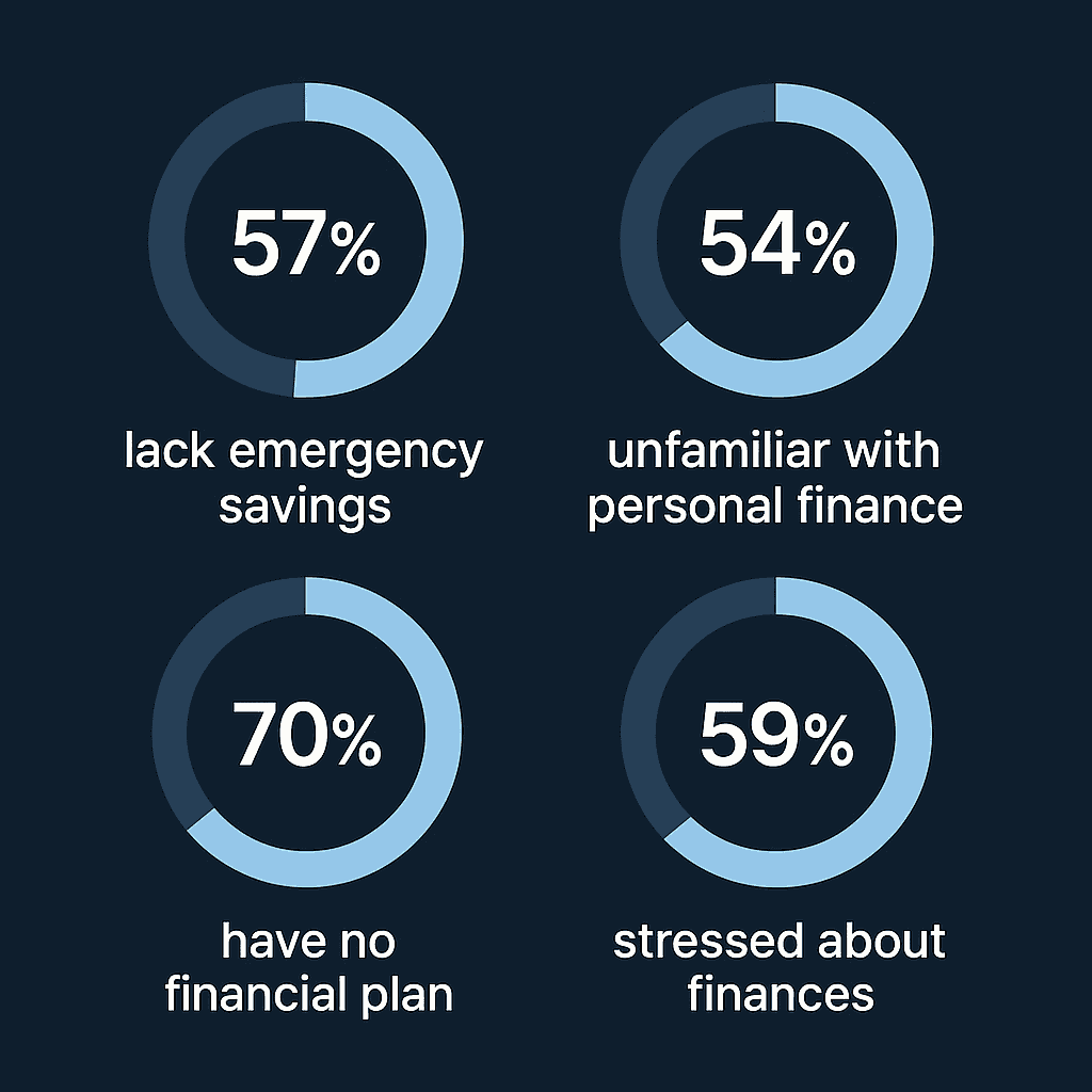
A growing body of research shows that people are struggling with personal finance.
57% of Americans can’t cover a $1,000 emergency.
54% say they’re unfamiliar with personal finance.
70% don’t have a long-term financial plan.
59% feel stressed or overwhelmed by their finances.
These pain points signal a clear need for smarter, more approachable tools that empower users to gain control over their money.
THE GOAL:
Design a user-friendly mobile-first application that empowers users to effortlessly track their spending, send money to friends securely, and make purchases with ease.
MY ROLE:
As UX Designer, I spearheaded the entire design process - from initial concept development to the creation of high-fidelity mockups for the final application.
2/8
the framework

Empathize
User Interviews
Surveys
Competitive Audit
Ideate
Card Sorting
User Flows
Prototype
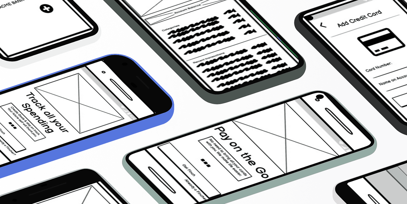
Wireframes
Prototypes
Test
Usability Testing

3/8

Understanding the competitive landscape: a user-centered approach
Asking the right questions:
Who are the key players? Identifying major competitors allowed us to benchmark their offerings.
What functionalities do they offer? Analyzing existing features helped us understand user needs and identify potential gaps in the market.
How are they perceived by users? Evaluating user reviews and app store ratings revealed user preferences and pain points regarding communication style and overall experience.
User-Friendly Finance over Financial Jargon:
Transparency is Key: Users value clear upfront pricing and real-time transaction updates, which builds trust and a sense of security.
Simplifying Finance: Financial language can be complex and off-putting. We saw an opportunity to create a user-friendly experience that simplifies financial management without the "stodgy-ness" often associated with traditional finance apps.

Research - uncovering needs and opportunities
Research Goals:
Understand user behavior: We explored how users interact with payment apps and the contexts surrounding their usage.
Identify pain points: By listening to user experiences, we aimed to uncover frustrations associated with existing financial tools.
Discover desired features: Understanding user needs helped us identify valuable features for our application.
Unlocking a Gap in the Market:
Demand for Budgeting Tools: A surprising discovery was the strong user interest in budget or financial tracking functionalities within the app. Users valued the ability to visualize spending habits and manage budgets through graphical interfaces. This finding highlighted a potential gap in the market for a user-friendly budgeting solution.
Future Feature Exploration: While international transfers fell outside the scope of this project, user interest in this area presented an opportunity for future product development.
Simplicity is Key: Users emphasized the importance of a streamlined data entry process and a smooth onboarding experience. "Simple" was a recurring keyword throughout the interviews.

4/8
MAKING USERS...HUMAN!

Personas and user journeys - bringing users to life
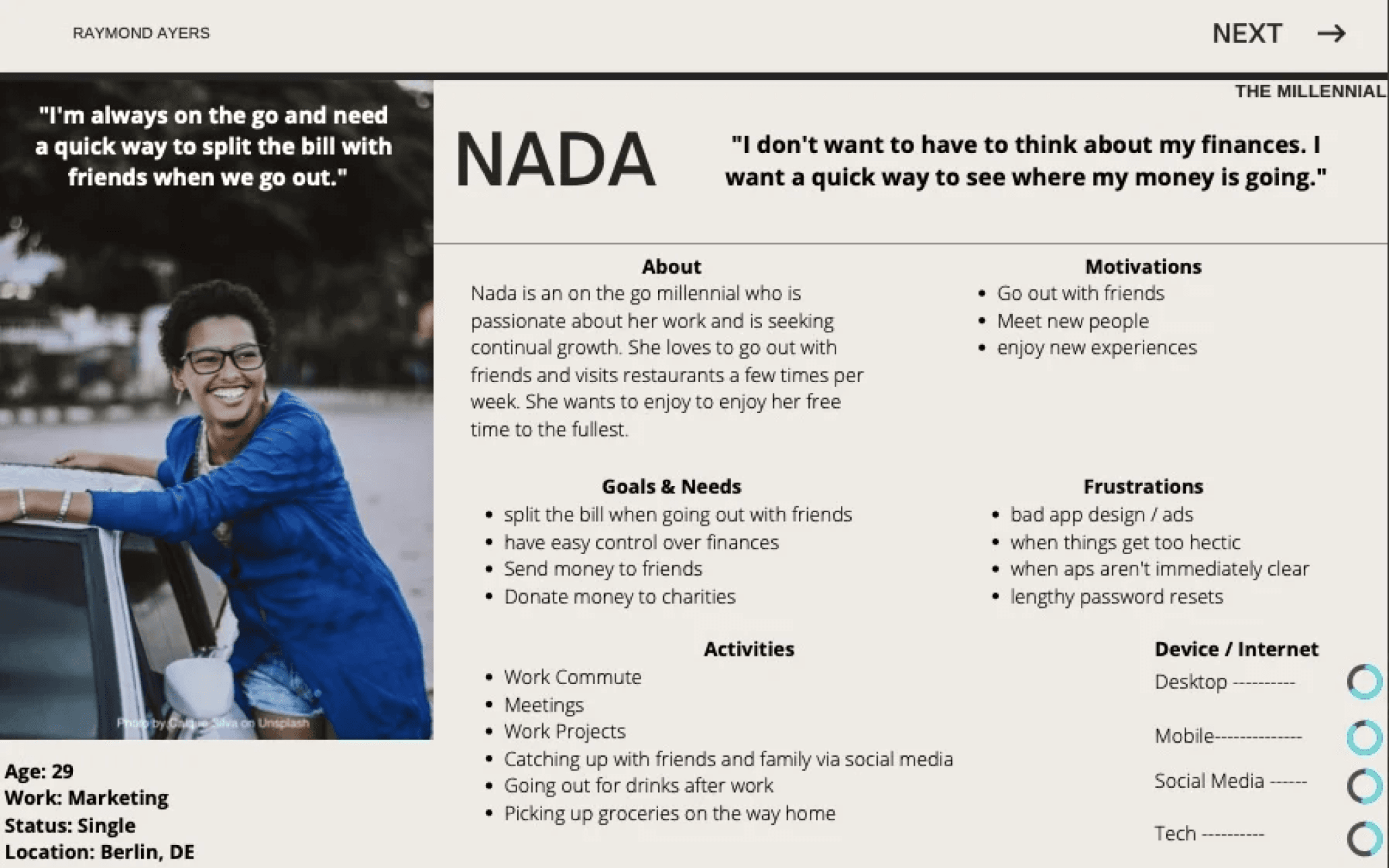
Meet Nada & Günther: Our Target Users:
The research identified two distinct user types:
Nada: A young, single professional who enjoys an active social life. She desires a user-friendly way to track her spending and manage her finances.
Günther: A family man seeking a more efficient way to manage credit cards, simplify payments, and track household expenses.
User needs in focus:
Developing these personas fostered a deep sense of empathy and clarity. By humanizing our target audience as Nada and Günther, their needs remained at the forefront of every design decision. This user-centric approach provided a solid foundation for creating a financial management app that caters to both Nada and Günther's specific needs.
5/8
idiation Nation...


Information architecture: building a user-friendly navigation
Refining the User Journey:
Iterate on Site Structure: Through card sorting sessions, we evaluated different layouts and identified the most intuitive arrangement for users.
Refine Labeling: We tested various labels for app functionalities to ensure clear and user-friendly terminology.
Frictionless Money Transfer and Streamlined Navigation:
Money Sending: User testing revealed a need for a more intuitive money-sending experience, especially for new users. This was addressed by integrating the functionality into two key areas:
Contacts Page: Users can now easily send money directly from their contact list.
P2P Transaction Flow: The money transfer option is readily available when initiating a peer-to-peer transaction.
Navigation and Settings
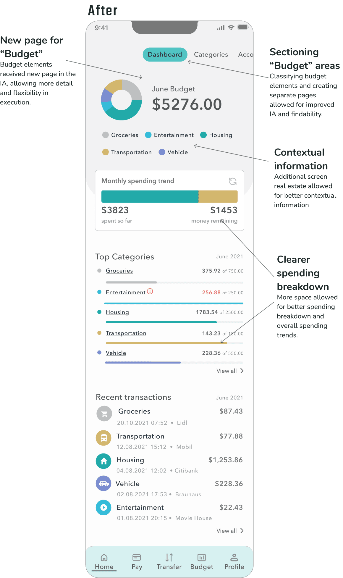
The navigation was streamlined by removing the "wallet" label and placing "send" and "receive" options directly within the menu for easier access.
Based on user feedback, a dedicated notification icon was implemented on the home screen to provide quick access to notification settings, previously buried within the general settings menu.
6/8
PUTTING IDEAS ON THE CANVAS
Wireframing: building the app's foundation
The Wireframing Process:
Prioritizing Usability: A core goal was to ensure users could easily complete key tasks within the app's core functionalities. Usability testing with target users played a critical role in identifying areas for improvement.
Gathering Stakeholder Feedback: Valuable input from stakeholders helped refine the wireframes and ensure alignment with project goals.
Mobile-First Design for a Seamless Experience:
Mobile-First Design for All Devices:
To ensure a smooth user experience across all screen sizes, a "mobile-first" approach was employed. The navigation menu was placed at the bottom for optimal usability on mobile devices and gracefully transitions to a top position on tablets and desktops.
From Wireframes to Finch:
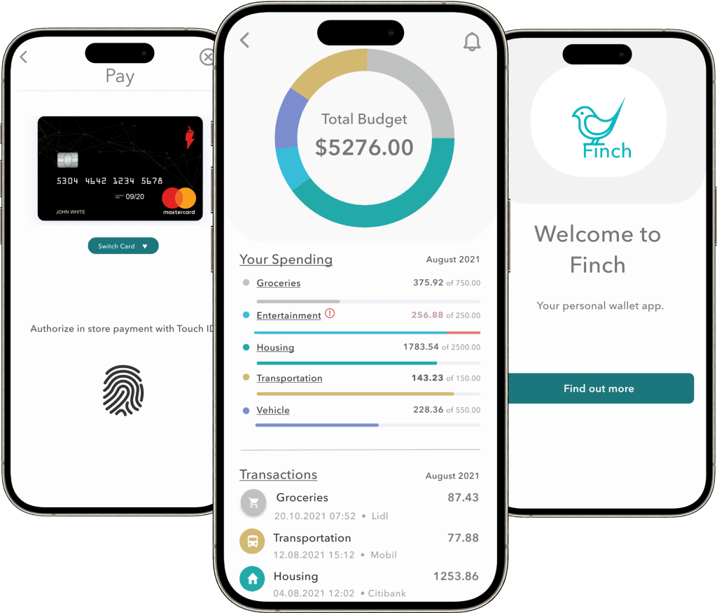
Mid-fidelity wireframing not only solidified the app's structure but also yielded its name: Finch. This stage allowed for design exploration alongside usability testing. Valuable user feedback identified areas for improvement, which we'll discuss next.

— Paul Arden
7/8
failing towards excellence
Usability testing surfaced several opportunities to improve clarity, hierarchy, and navigation within the dashboard experience:
Planning, Observation, and Analysis:
Planning & Scripting: A documented test plan outlined objectives, methodology, and recruitment criteria. A test script ensured consistent execution across all participant sessions.
Data Collection & Evaluation: Following the testing sessions, findings and user feedback was documented. Usability issues were rated using Nielsen's Severity Scale to assess their impact.
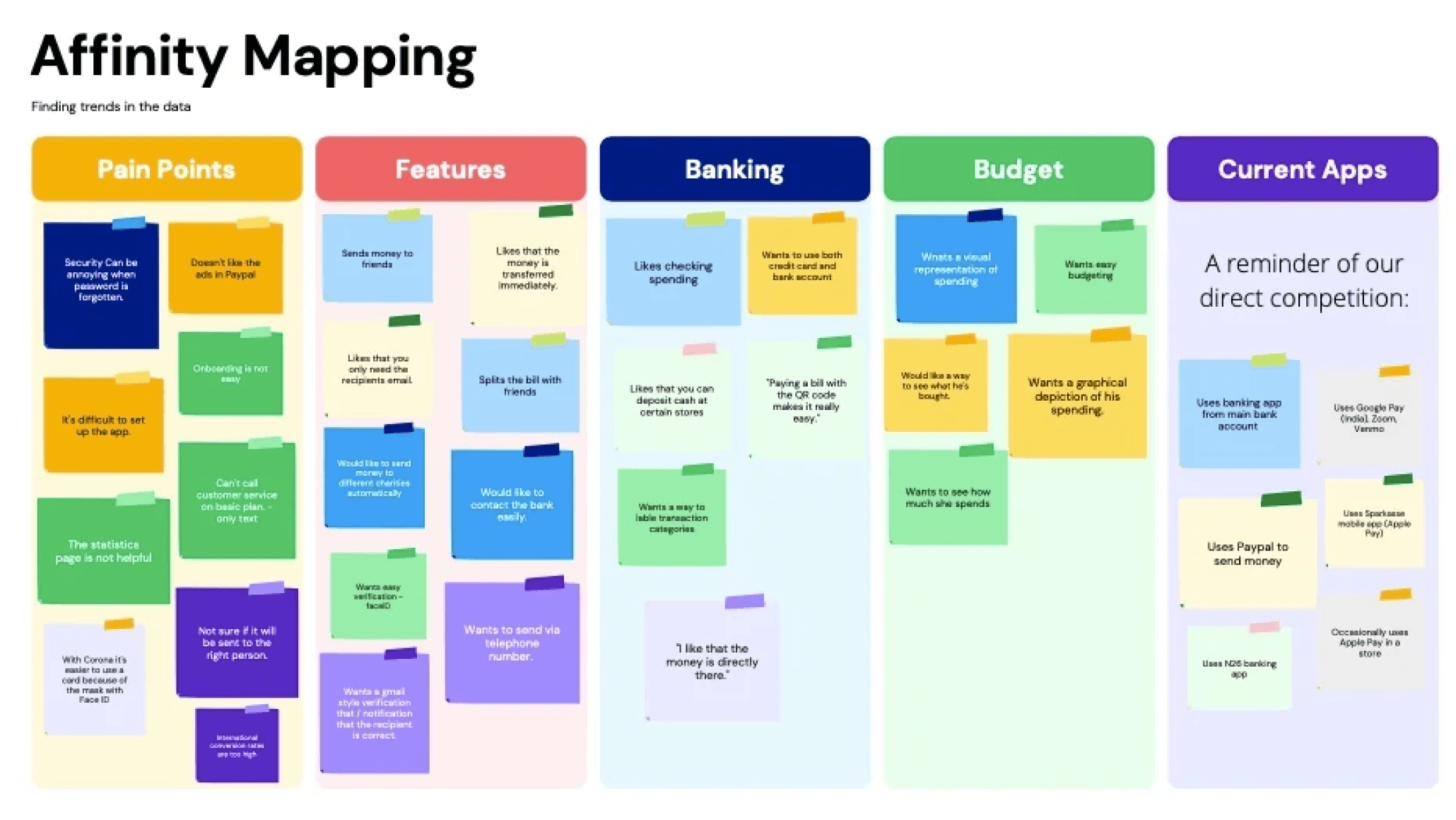
Data Organization: To identify patterns and prioritize user feedback, two key techniques were employed: Affinity Mapping, a visual approach for uncovering themes, and the Rainbow Spreadsheet, which allowed categorization and prioritization of feedback based on various criteria like frequency and severity.
🔧 Usability Fix: Problem → Action → Result
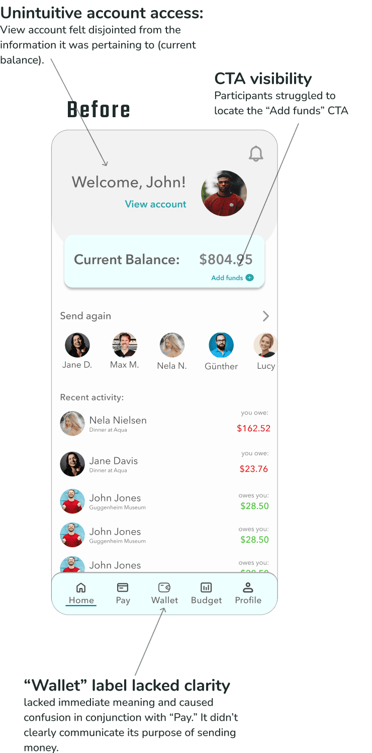
🧩 Problem: Users struggled to complete core tasks—adding funds, accessing account settings, and interpreting balances—due to poor hierarchy, unclear labels, and misplaced CTAs.
⚙ Action: We clarified the layout by repositioning funding actions near the account balance, reduced visual noise by minimizing the greeting and removing the profile image, and improved navigation by replacing vague labels like “Wallet” with clearer terms like “Transfer.”
📈 Result: Users completed tasks faster, navigated more confidently, and clearly understood their account and budget information—leading to a more intuitive, trustworthy experience overall.

🔧 Budget Clarity Fix: Problem → Action → Result
🧩 Problem: Users were confused by the proximity of account balance and budget totals, and found the budget categories cluttered and hard to interpret—leading to uncertainty about where their money was going.
⚙ Action: We restructured the information architecture by giving budgets their own dedicated section, allowing for clearer layout, improved categorization, and more contextual guidance around spending trends.
📈 Result: Users better understood how their budget related to their available balance and were able to navigate and interpret spending insights with greater ease and confidence.

usability test insights
Funding CTA Lacked Visibility
Participants struggled to locate the call-to-action for adding funds. The button was visually subtle and not positioned where users expected it.Account Access Felt Unintuitive
Users expressed frustration when trying to access their account settings, noting that the greeting and profile picture—currently serving as the entry point—didn’t feel meaningful or clearly interactive.Balance & Budget Placement Caused Confusion
Displaying the account balance and total budget in close proximity created cognitive dissonance. Participants weren’t sure which figure to focus on or how they related to each other.Budget Categories Felt Cluttered
The arrangement of budget categories on the dashboard felt disorganized to users. Several participants described them as “out of place” or “crowding the experience,” making it harder to get an at-a-glance understanding of their finances."Wallet" Label Lacked Clarity
The term “Wallet” in the tab bar wasn’t intuitive to most users. It lacked immediate meaning and didn’t clearly communicate its purpose or contents.
8/8
wrap up
Wrap-Up: Designing for Clarity, Control, and Confidence
THE WHAT:
We turned a confusing finance experience into one that was clear, intuitive, and easy to navigate.
Through research, iterative testing, and close attention to user feedback, we:
Identified key friction points that were undermining confidence.
Restructured the dashboard to improve hierarchy and reduce visual noise.
Reframed navigation and labeling to make core actions more discoverable.
And most importantly, helped users feel more in control of their money.
What started as subtle layout and language tweaks became a major usability win. And it was a reminder that small design decisions—like button placement or terminology—can have an outsized impact on trust and comprehension.